
Designing a Dual-Audience Product Landing Page System
This portfolio piece documents the design of a dual-audience product landing page system built for a functional wellness brand.

While this project was implemented within an ecommerce environment, this work is not best understood as marketing execution. This is an applied design and human-centred systems project focused on information hierarchy, decision clarity, and supporting different mental models within a single product experience.
The core challenge was not traffic or messaging. It was sensemaking.
One Product, Many Contexts
A single product needed to make sense across multiple real-world contexts:
paid media, where people arrived with high intent but limited background
in-store QR scans, where pricing and promotions for brand channels could not be shown
retailer education and training environments
organic search, where people were researching over time
Each context came with different expectations, constraints, and levels of readiness.
Designing for an “average user” would have failed everyone. What was needed instead was a structure that could orient people quickly, allow depth without forcing it, and remain useful even when no transaction was possible.
This was a design problem, not a persuasion problem.
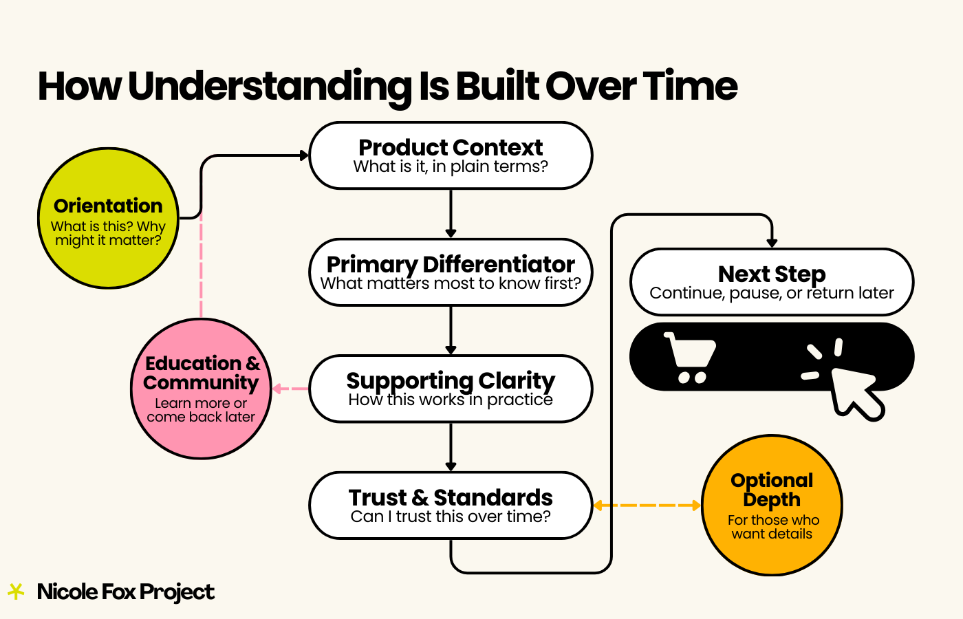
Orientation Before Persuasion
Each landing page was designed to ground people first.
The experience began with a clear banner and headline that answered a simple question: What is this product, and why might it matter? Supporting context followed immediately, establishing credibility without urgency or hype.
The goal at the top of the page was not conversion. It was orientation.
Many visitors arrived with intent but little context. Providing clarity upfront reduced cognitive strain and made it possible to continue exploring at their own pace.
Layered Information, Not Overload
Information was structured deliberately and progressively.
Each page followed a consistent pattern:
a clear product preview
one primary differentiator
a small set of concise call-outs focused on formulation, absorption, convenience, and suitability
optional deeper detail for those who wanted it
Nothing was hidden, and nothing was forced. People could skim or go deeper without penalty.
This approach respected different reading styles, energy levels, and needs. Someone seeking reassurance could stop early. Someone looking for evidence could continue.
Depth When Needed, Calm by Default
Highly detailed information, such as full nutritional breakdowns, were made available through optional interactions rather than embedded directly in the main flow.
This allowed the page to stay readable and calm while still supporting transparency and trust. The system did not reward speed or punish caution. People were allowed to take the time they needed.
Trust Introduced After Understanding
Testimonials, quality standards, and credibility signals were introduced later in the experience, once people had enough context to evaluate them meaningfully.
Rather than leading with persuasion, trust was built gradually through clarity, consistency, and plain-language standards grouped in one place.
Education & Community as Part of the System
Education and community were treated as part of the product experience, not as separate content.
Each landing page connected outward to relevant educational posts, community-generated recipes, and video explanations. These links supported learning and re-entry rather than pushing toward purchase.
The landing page functioned as one node within a broader ecosystem, not a dead end.
Designing for Retail Without Breaking Trust
In retail contexts, these same landing pages were adapted to remove pricing and promotions entirely.
The structure remained intact, but transactional elements were intentionally absent. This allowed the pages to function in-store, in training environments, and alongside retailer pricing without undermining trust or autonomy.
One system served multiple environments without fragmenting the experience.
A System, Not a One-Off Page
This structure was applied consistently across a large and complex catalog, including bundled products designed by clinical practitioners that required additional explanation.
What was built was not a collection of individual pages, but a repeatable system that scaled across products and contexts while remaining coherent without constant intervention.
Clarity was treated as a safety feature, not a performance tactic.
Why This Work Matters
When one system serves multiple audiences, lack of clarity shows up quickly. Good design does not remove complexity. It organizes it.
This project reinforced that effective design:
respects different mental models
reduces cognitive load
allows people to decide when they are ready
supports understanding before action
The result was not a “high-converting” page, but a calmer, more legible product experience that held up across real-world conditions.
This is the kind of work I want to continue doing: designing systems that support people as they are, not as systems wish them to be.